ANOTHER ATTEMPT AT HAIGA
In an earlier post (FIRST ATTEMPTS AT HAIGA), I shared two haiga I'd found photos for on the internet and then added my own haiku to, while learning how to use Paintbox.
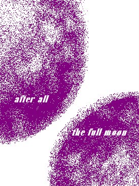
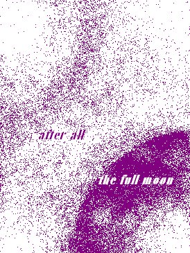
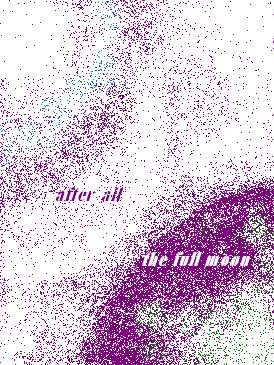
I've now attempted to use Paintbox to create my own picture to go with a minimialist haiku of mine that I share four versions of below.
I have also been working with oil pastels and colored pencils -- and may try some water color, as well -- to make a haiga with this particular haiku, but thought I'd share the process as it has evolved so far with Paintbox. Until I set up my scanner I won't be able to share the other sketches.
Using a mouse to do any sort of drawing is quite a challenge and I am fairly dextrous. As my roommate and I were commiserating over this sad fact, she mentioned that there's something called a "tablet" on which you can actually draw into the computer with a stylus/pen. Oh, boy, something else expensive for me to lust futilely after! :-) Though I'm not truly all that frustrated as it's been lovely to start doing some hand-drawing again. When I was a child I had been slated by my family to be a visual artist and I continued to draw and paint though not much in recent years. Maybe being on a fixed income and having this intense desire to make my own haiga will bring me back to that old love.
Of the four Paintbox versions below, I am most partial to the "full moon purple 9" as I think its simplicity echos the haiku's. Though loving colors as I do, it's almost a tie between #9 and #11. Any comments?
[full moon purple]
* * * *
[full moon purple 4]

* * * *
[full moon purple 9]
* * * *
[full moon purple 11]
* * * *
Resource: Haiga Gallery; also has haiku.
‘til next time, keep dreaming,
Roswila
[aka: Patricia Kelly]
****If you wish to copy or use any of my writing or poems, please email me for permission (under “View my complete profile”)****My other blog: ROSWILA’S TAROT GALLERY & JOURNAL.
posted by Roswila @ 11:52 PM
![]()
![]()


2 Comments:
I like #9 the best, too, as far as the image goes. The Moon should be more distinct and the sky less so, and 9 and 11 do that best.
9 and 11 give the upper-left image more of a chance to be something like the Milky Way. If that is your intention, it needs to be even less curved I think.
I would also ask for more contrast between the letters and the image, so the poem stands out a bit more. In traditional haiga the poem is apart from the image.
In The Tale of Genji there is a reference to a technique of drawing the letters of the poem so that they form the image on paper. Not a technique that would be understood today, I think!
oino
Yes, the upper left of both #9 and #11 can be the Milky Way. It can also be the Sun, the Earth, the nucleus or electron of an atom, etc., etc. And in #11 the upper left can be seen as the sky/sun and the lower right as the earth/moon .... "after all...." :-) (BTW, none of these associations were in my mind as I began these drafts. They came later as I fooled around with paintbox.)
Yes, definitely, there needs to be more contrast between the words and the image when I settle on the final image. Doubt I'll separate words and image. I like the blend too much. :-D
Hm, letters written so they form the image: in my first oil pastel and colored pencil drafts for this image I have the words arching like branches across The Moon. I still like this visually but couldn't figure how to do it in paintbox.
Thanks for visiting and for your thoughtful comments, Oino. It does help as I literally feel my way around this form.
Post a Comment
Subscribe to Post Comments [Atom]
<< Home